Chicago Reader
Post
July 29, 2014
Every week during a stretch of the Chicago Seed‘s 1967 to 1974 print run, staffers would make the trip: a pickup or VW Minibus loaded with hand-mixed ink and negatives for the next issue—diligently pasted up and typed out twice on an IBM Selectric—would drive two hours north to Port Washington, Wisconsin, so William Schanen, a free-press advocate, could print roughly 35,000 copies overnight. Loaded down with so much weight on the return, the van would often fishtail on the highway.
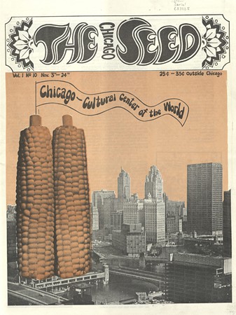
Editors and artists both described the process of making the psychedelic Seed as chaotic. The paper could hopscotch from a naked woman (the cover of the first issue) to an interview with George Harrison to a detailed drug guide (“domestic monster dop . . . $85.00/100 per pound”) in the space of three pages. But with daring covers and split-fount inking, which produced subtle changes in color over the course of a print run, the paper stood out amid the colorful artwork of the time.
“There was something in the air those days, it was everywhere,” says Skip Williamson, a famous underground cartoonist and Seed contributor. “The Seed was a part of it, but then it was gone.”
A child of the 60s, with lineage that includes the West Coast poster art of Rick Griffin, Robert Crumb‘s comics, and the poster art of the Fillmore, the Chicago Seed was the city’s biggest weekly underground paper. It met halfway between the psychedelia of San Francisco’s Oracle and the protopunk, antiauthoritarian leanings of the East Village Other, two other free-press imprints of the time. Started by Don Lewis and Earl Segal in 1967 and initially run out of the Mole Hole, Segal’s Old Town head shop, the paper was “trying to build a community,” according to longtime editor Abe Peck, a media consultant and professor at Northwestern’s Medill School of Journalism who wrote the book Uncovering the Sixties about the underground press.
“Mayor Daley once said, ‘What trees do they plant, what are their roots?'” says Peck. “We took that very seriously. If you look through the paper, we had this whole framework of stories—draft resistance, drug information, high school stories . . . We wanted to get out of the money economy, and for awhile, it seemed like it was something that could happen.”
As the Seed grew and became closely associated with the Yippie movement, and Segal and Lewis sold the paper to Harry Dewar, a graphic designer, and Colin Pearlson, a photographer, the design and art of the paper evolved, reflecting the collective staff and increasingly tumultuous political scene. Covers, created by a stable of local artists or drawn from the Underground Press Syndicate, a kind of copyright-free wire service for alternative papers, favored bold images that told a bigger story instead of everyday photos (“Everyone knew what Vietnam and the military looked like,” says Peck). The inside could be just as striking, featuring poster-size pullouts with Day-Glo ink, gradient backgrounds, a wealth of major-label music ads, and intricate drawings. While it was never incredibly lucrative—art director Lester Dore said that at one point they were making so little money the staff would get paid in papers and go out and sell them to pay the rent—the exposure was valuable. Comic artists like Williamson and Jay Lynch, who both worked for other Chicago publications like the Bijou Funnies or the Chicago Mirror, would ink strips. Williamson’s ads for a local head shop ran in just about every issue.
According to Peck, the Seed‘s cover art started with the “naked girl period” of nymphs and flowery letters, but gradually became more militant after the convention crackdown and Fred Hampton’s death in 1968.
“The Seed was always a spectrum of politics,” he says. “I mean, we were tackling everything at once, politics and process, and still trying to put out a paper.”
A symbol of its era, the Seed folded in 1974, a victim, in part, of advertisers shifting to more mainstream publications. To get a better sense of the artwork, I’ve created a gallery of Seed covers and asked former staffers to tell the stories behind the artwork. (Click the link at the top of the post to view the slideshow on the Reader website).